
Sometimes you reach a point where writing another book isn’t going to sell more of the earlier ones. One more promotion, one more guest blog, or one more interview isn’t going to kick your books from where they are to where you want them. Sometimes what you need is to step back and look at what might be holding them back.
My problem
For my Black Ocean series, it was time to address the covers. There were two problems, I think, with the existing covers. They were functional, of course. But for starters, I’d gone with the series name as the focus, which was probably a mistake. Secondly, they didn’t “pop.” Popping is one of those technical terms that is hard to describe, but you can easily identify it when it happens. It wasn’t happening with the existing covers. Now don’t get me wrong, I like the existing covers. I didn’t design them, but I had a hand in mocking them up, and these covers are more professional versions of my mockup. But the covers aren’t for me. Covers are to entice readers.
After a lot of searching (and a failed 99 Designs contest that didn’t yield the results I was looking for), I finally found a real pro in cover design, someone with a track record not just of making covers, but of taking books that had covers already and making better ones. And among the first things my cover designer asked was if I could change the name of Book 1.
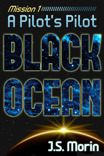
The Original Cover and Title for Mission 1
“A Pilot’s Pilot,” was going to look repetitive, I was told. It wasn’t anything I’d considered. It was already a title I was iffy on. Again, it was a title for me, a little clever play on words in that the main character was not only a pilot among pilots, but also that it was pilot episode in the sense of a television series. In retrospect, I’m sure readers didn’t care.
Rebranding an existing series
I needed a title with a better hook, one with more of a tie to the plot. Hence, Salvage Trouble. Mission 1 is about a salvage mission gone wrong, and the fallout as a rescued passengers of a derelict freighter draw the attention of bounty hunters and corporate goons. Don’t get me wrong, there’s plenty of piloting, but that doesn’t hint at the action the way Salvage Trouble does.
So what were the goals with the new cover?
- Redirect attention from the series title to the mission title
- Come up with a branded logo-type series title that can remain consistent from book to book
- Don’t fall into the trap of a bland font treatment (the problem with most of our 99 designs entries)
- Show characters, so that the impression isn’t of just a disembodied ship
- Still look like a space opera cover (since Black Ocean is fantasy in space opera clothing)
- “Pop”
- Have a theme/format that can be taken as a template for all current and future missions, including the prequel short story and mission packs (bundles of books 1-4, 5-8, etc.)
Simple, right?
Of course not! This was a tall order, and it took a few iterations bouncing ideas back and forth. But this is exactly the reason to go with a professional cover designer with a track record. There are plenty of designers out there who can give the “A Pilot’s Pilot” version: a cover that works. That wasn’t the goal. I had that already. I needed someone who could go down that list and not only tick off all the boxes, but knock it out of the park.
And let me tell you, it can be a harrowing process. There is a reason that any good design is iterative. Any first concept or mockup is going to set off alarm bells in your head. “Oh my god, this isn’t what I meant at all!” “Am I going to get a worse cover? Maybe I should call it off before it’s too late.” “Has this person ever seen a book cover before?” Of course, it’s all overreaction. Mockups suck. It’s part of their job. They’re a cluster of ideas thrown together Frankenstein-style to give you something to pick and choose, to critique and scavenge from. I like this font. I hate that stock image. Can you space these two things out? Can you do something better with the title? And so on and so forth, until you’ve got a cover that jumps off the page.
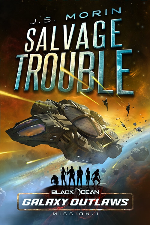
The new cover for Salvage Trouble, renamed in an effort to make a better, snappier cover.
The cover won’t be exactly what you envisioned, 99% of the time. If you could envision the best cover for your book, and had any photoshop skills, you’d have done it yourself. The designer is there to take your direction and do better than that. And I think that’s what I got: not what I set out looking for, but even better than I could have come up with on my own.
Self-publishing advocates often tout the freedom to choose your cover as a key advantage over traditional publishing. And to an extent, that’s true. But for every horrible cover inflicted by a big-name publisher (and they’re far less common than they used to be), there are a hundred self-published covers that are just as cringe-worthy. By putting your cover in the hands of a professional, you can try to take the best of both worlds. Step back and let someone without the emotional ties to your book come up with the cover, but still keep editorial control and final say about the result.
Next Steps
Work is already under way on the rest of the series. So far there is no plan to change any of the other titles, but all the covers will get reworked. Alien Racer’s cover is already live on Amazon, and the rest is coming close behind.
Why Alien Racer next, you ask? Well, because Mission 5 is meant to be a secondary entry point to the series. Missions 1-4 are going to get bundled (coming soon!) with their own cover, and Mission 5 was going to be the first of the second block of missions. I wrote it bearing in mind that I didn’t want to rely on the back story from the previous missions for readers to get a great experience from it. In theory, each can be read as a standalone, but I think some are more reliant on the previous mission’s plot points for their setup than others.
After Alien Racer, then Missions 6 and 7 will come out with brand new covers upon their initial publication. The free prequel, Tech, Lies, & Wizardry will have one too. Then the mission 1-4 pack, then finally A Smuggler’s Conscience, Poets and Piracy, and To Err is Azrin will get their cover updates. This fall there will be a cover for the 5-8 mission pack.
After that, I’m done with Black Ocean for 2015. Look for a new series of missions (9-12) in 2016.
I absolutely love this new cover. It gorgeous!
Amazing work from your designer.
And good call to get new covers in the first place.
This must take your sales to the next level for sure. I wouldn’t have paused a second on Amazon to take a closer look before, but I definitely would now. Love everything about it! So even if you have awesome sales numbers, they should go through the roof with this update.
Congratulations on both the decision and the new cover 🙂
The old cover was good, but I have to say, the new cover is absolutely amazing. Easily as good as any traditionally published book cover. Congrats on the rebrand and best of luck with future sales!
Glad you like it. I’m really pleased with how the new covers are coming out, and proud to have them on my books.